- Out-of-Stock


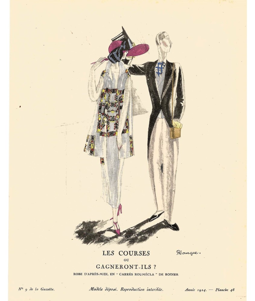
Nº 9 GAZETTE DU BON TON. PLANCHE 48. 1924
The Gazette du Bon Ton, put out by the retailer of the same name, was considered the trendsetting magazine of the era. Founded by Lucien Vogel and targeting Paris's upper class, it ran from 1912-1925.
There is not much biographical information on who we are dealing with today, Pierre Mourgue. Its French origin is known and it is assumed that it was born in the late 19th century. His first works have remained as part of the illustrations of one of the main fashion magazines in Paris from the first decades of the 20th century, the "Gazette du Bon Ton". This prestigious magazine, founded in 1912 by Lucien Vogel and distributed by Condé Nast, became known in America as the "Gazette du Bon Genre" and with other translations such as "Journal of Good Taste" or "Journal of Good Style" and stood out from the beginning, by the participation in it of the most prominent illustrators of the moment. Among them was Mourgue.
When Condé Nast takes over “Vogue”, he soon incorporates many of the collaborating illustrators of the “Gazette du Bon Ton”, one of them, Pierre Mourgue, moves to New York and begins creating for the North American magazine, thus providing the Parisian touch necessary to give prestige to “Vogue” with the link to the fashion mecca.
But Mourgue was not limited to work exclusively for "Vogue". His work covered many more fields, from promotional work for specific products or as a regular collaborator of the great fashion creators of the moment. Lucien Lelong, Jacques Griffe, Givenchy, the Vionnet house, Nina Ricci, Balenciaga, Dior, Jacques Fath ... are some of the designers who used their art to communicate their ideas. In addition, hatters, jewelers such as Camille Roger Chapeaux, Claude Saint-Cyr, Gabrielle, Blanche et Simone, among other names in the world of appearance.
As required by Nast's editorial policy, women created by Mourgue, like that of other illustrators of his time such as his colleague Pierre Brissaud, Mourgue, should convey vitality and be in keeping with their time. But what distinguishes Pierre is his ability to vary that communication, both in the message and in the way of transmitting it throughout the time he was active.
Thus we see how the ‘new woman’ of the 1920s appears in her images driving a car, calling on the phone, smoking… as if they were real de flappers ’and they were in a marked marcado art deco’ style. On the other hand, if we stop at his works of the following years, the marked difference of the environment, the attitudes and, of course, the illustrative style, refers us to the austerity typical of the war years, highlighting that essential element of ' 1940's fashion look like the feminine headdress.
With the advent, triumph and permanence of the "New Look", Mourgue continued to adapt her art to the demands of the new canon of beauty. Each fashion, more than clothing, hides messages in different ways. The “New Look woman” with her sophisticated and super feminine attitude, demanded another type of illustration and other attitudes… and the genius of Mourgue succeeds….